In the Dashboard module, the user can monitor the business process of individual fields and status that can be combined with individual views. That gives a project manager, test manager, or others the powerful option to monitor the (actual) business development and test process of actual key values. aqua allows to create cross-project dashboards with widgets and KPI alerts that highlight critical data constellations.
Creating a dashboard
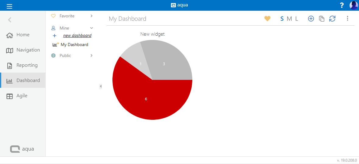
To create a dashboard click on New dashboard on the left hand side. Now, choose a name for you new dashboard. On the top right, you can find settings for your dashboard.
|
Button
|
Function
|
|
|
Mark dashboard as favorite
|
|
|
Change size of widgets
|
|
|
Add widget
|
|
|
Refresh dashboard
|
|
|
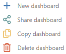
More functions
|
The functions behind the more button are as follows:
Creating a widget
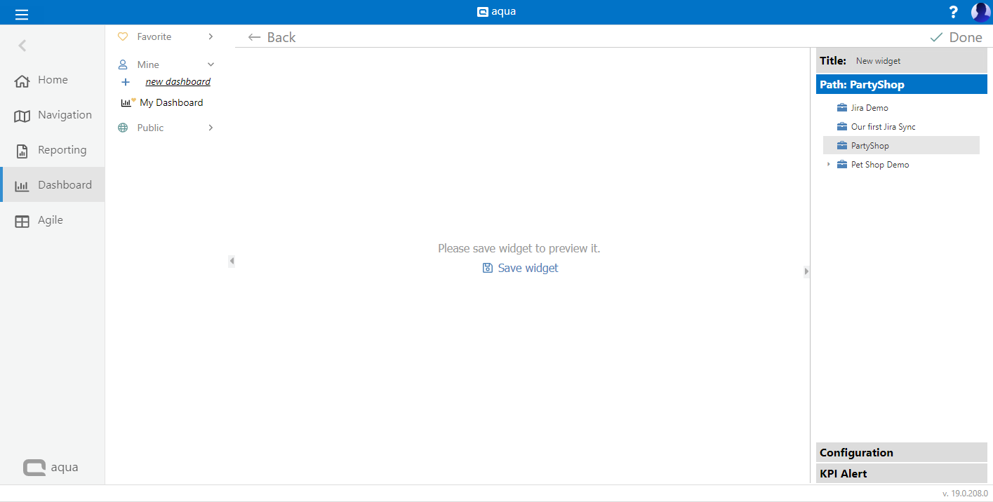
To add a widget, click on
Add widget in the middle of the screen if it is a new dashboard, or on the plus

button on the top right. Give it a title and choose the project or a sub folder for the data to be considered.
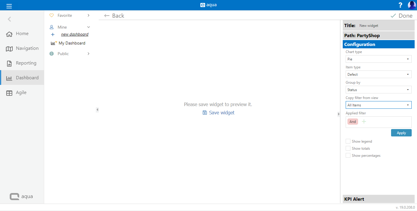
Click on Configuration to define the chart. Select a chart type and an item type. Now define the Group by field and choose a filter if you need one.
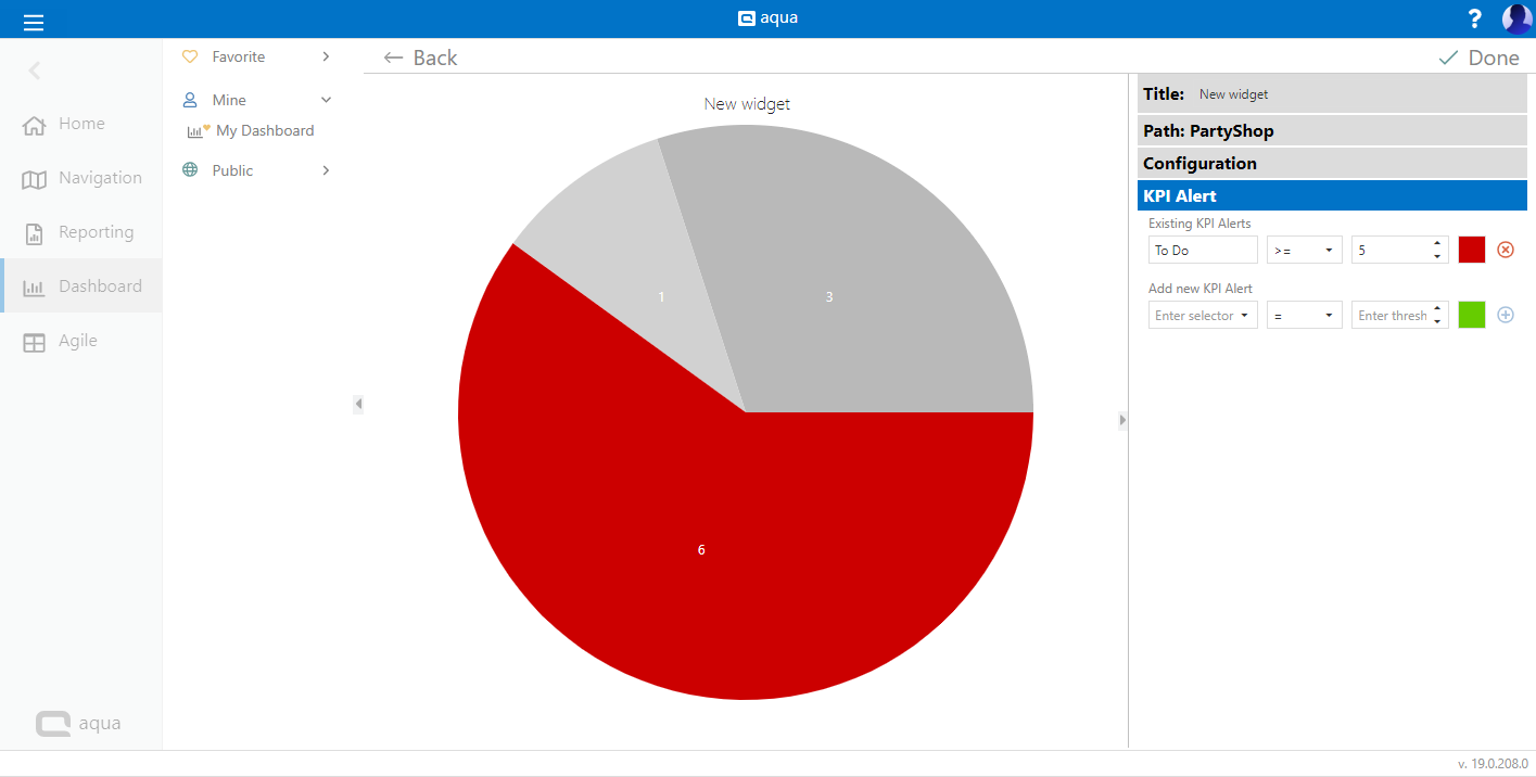
KPI Alerts
KPI Alerts are very useful to improve the overview over your project. A KPI Alert will change the look of your chart, if a certain expression is true. Thus, you will instantly see, if something important happens in your project.
If needed, click on KPI Alert to define alerts, if a specific KPI is reached. Here, add a selector, e.g. a specific status. Now select your operator of comparison, e.g greater than. Add a number. Thus, you receive an expression, like "Not analyzed > 5". Select the color the bar or the piece of thepie chart should have, if the expression of your KPI Alert is true. To save your alert, click on the plus button next to it.
To save your widget, click on Done. Your first chart will now be visible on your dashboard.
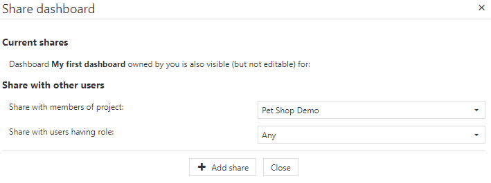
Share a dashboard
To share a dashboard, click on the more button on the top left. Select Share dashboard.
Now you can select, with whom you want the dashboard to be shared. Select members of a specific project and/or users that have a specific role.
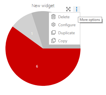
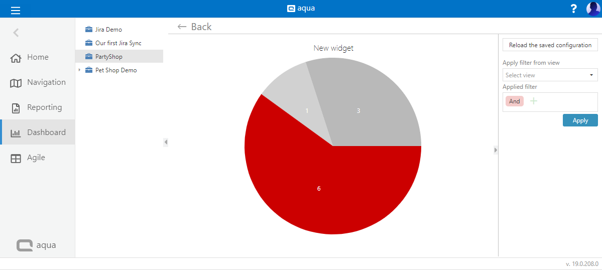
Maximize a chart
For a deeper analysis of a single chart, you can maximize it. To maximize a chart, hover it with your mouse. A mouse over menu will appear, where you can delete, configure or maximize the chart.
Click on the square to maximize the chart. Now you see your aqua project tree on the left hand side. Select for example a sub-folder or change the view, to deeply analyze your chart.